Choosing paint colors can feel overwhelming. I’ve learned through experience that even a color I love on a sample can feel completely different once it’s on the wall. After repainting more than one room over the years, I finally simplified the process by using a consistent neutral palette in each home. In this post, I’m sharing the paint colors we used at the Sutton Place home, and in our current home on Sugar Maple Court.

This post may contain affiliate links. See my disclosure statement.
Sutton Place Interior Paint Colors
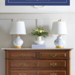
At the Sutton Place house, a single neutral was used throughout the main living spaces. The color began as a custom match and ended up becoming the foundation for the entire home. Keeping the walls consistent made decorating simpler and helped every room feel connected.
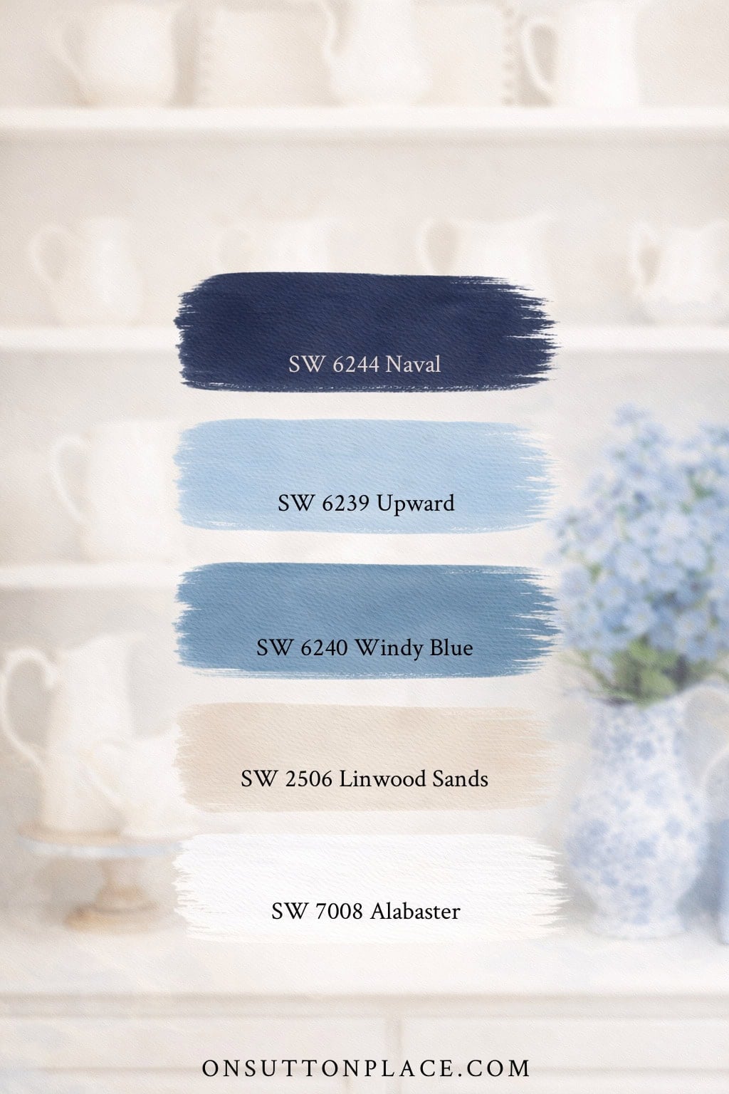
- Sherwin Williams Alabaster: used as the primary neutral throughout the house. Soft, warm, and easy to live with.
- Sherwin Williams Naval: a true navy blue that was used on the front door and kitchen cabinets. After trying many navy shades over the years, this one finally felt right.
- Sherwin Williams Windy Blue: used on the kitchen walls. Light and fresh with a subtle hint of periwinkle.
- HGTV Home by Sherwin Williams Linwood Sands: used in the dining room above the board and batten. A warm neutral that paired beautifully with wood tones and trim.
- Sherwin Williams Upward: used in the entry. This shade sits just one step lighter than Windy Blue.
Sutton Place Exterior Paint Colors
Over the years, I’ve received many questions about the exterior paint colors at the Sutton Place house, especially the siding and shutters. When it was time to repaint the house, I matched the existing colors and stayed with shades from Sherwin Williams.
- Siding: Morning Fog (flat finish)
- Shutters: Grays Harbor (satin finish)
- Front Door: Naval (satin finish)
- Trim: Extra White (semi-gloss)

One important lesson I learned with this project has to do with finish. Because the siding was original to the house and had a few dents and imperfections, a satin finish only highlighted those flaws. A flat finish would have softened them instead. If your exterior siding isn’t perfectly smooth, choosing a flat finish can make a big difference. Live and learn.
Sugar Maple Paint Colors
When we downsized and moved to our current home on Sugar Maple Court, I knew I wanted a neutral color in the main living spaces. The goal was to find a wall color that worked with the existing kitchen cabinets and flowed easily from room to room. After testing several options, the choice ended up being very clear.
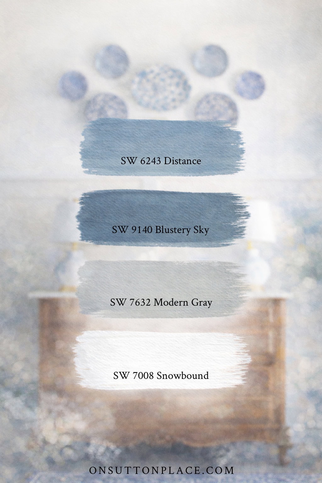
- Sherwin Williams Snowbound: used on the main living area walls and all the trim. This shade worked well with the kitchen cabinets, which are white with a soft gray undertone.
- Sherwin Williams Modern Gray: a true greige that stays neutral without leaning too warm or too cool. Used in the guest bedrooms and on the board and batten in the foyer.
- Sherwin Williams Distance: used on the front door. I originally planned to repeat Naval from Sutton Place, but it felt too dark against the stone exterior. Distance offered the right balance and stands out without overpowering the entry.
- Sherwin Williams Blustery Sky: being added as part of a guest bedroom and bathroom refresh. One wall of board and batten in the guest bath will be painted this color.
Frequently Asked Questions
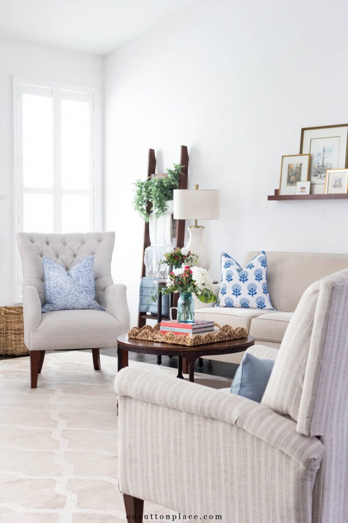
Choosing paint colors doesn’t have to be complicated. Using a small, neutral palette has made decorating easier for me and has helped each home feel calm and connected. If you’re feeling stuck or unsure, start simple and give yourself time to live with a color before deciding it isn’t right. Paint can always be changed, but finding what feels comfortable in your home is worth the patience.


JOIN THE OSP COMMUNITY
Sign up to get uncomplicated recipes, unlimited seasonal decor, and
understated ways to refresh your home sent straight to your email inbox!
Were you happy with how the siding looked when painted? We have to decide between painting or replacing our siding soon. Thank you for the suggestions for paint colors. Our house is very similar to your Sutton home.
Hi Kathy…yes, our siding looked great after it was painted. Except for the sheen mistake, we were very happy. We had aluminum siding, not wood.
Ann,
Thanks for sharing all your colors. I love how welcoming they all are. Happy Easter!
Hi, Ann!!! We just switched our siding color from beige to soft yellow— it looks amazing and very welcoming! The neighbors love it too. Our interior has all the blues you have featured— very calming and serene. Thanks for all you share with us!
Love the front door color. What color would you paint your front-facing garage door?
Hi Vanessa…my garage door is white. When we moved here, there were two doors that we eventually replaced with one. The two original garage doors were painted the gray of the siding. I really like the white better!
I agree that Naval is a very classic navy blue…it is also one of my favorites! I like it so much I painted three house exteriors this color! 😉
Thanks for the advice. I am a regular reader of your blog and appreciate the tips you share from your experience. Saves the rest of us from repeating them!
If I ever switched, it would be from blue to gray. Even though gray is a neutral, it adds color as well. Another option would be green. It’s very organic and soft. Good luck!
Oh my, I really like Naval. Looks like another trip to Sherwin Williams and repainting the front door will be on the to-do list soon. Your blog is a wealth of ideas and inspiration. Thanks!
I was so excited to see you chose the exact Sherwin Williams color (Naval) for your front door that I chose for mine last spring. I just love it and get many compliments on it. I have been agonizing over what direction to go in for inside colors and your ideas are so inspiring to me. Interestingly I have the same type off white stoneware in my kitchen as you have in your living room!
I am so happy too Jody…enjoy your home!
Hi Lauri! Yes it’s a flavor thing. The Campbell broth used to say on the label “double rich, double thick.” They changed the label but not the broth. I think it adds a lot!
Yes my kitchen is pretty…but dated and small. I have shown it a few times but it’s very hard for me to photograph. One wall is a ginormous window and I struggle with the lighting. Anyway, I need new countertops and a new sink. The appliances are fairly new and very nice. If I can, I’ll do a post on the kitchen soon. Thanks for your comment!
You are welcome Terrie…thanks for taking the time to leave such a nice comment. :)
My husband has always let me do what I want in regards to color, paint, fabric, etc. He honestly has no opinion even though I’ve asked a million times. He does, however, have an opinion about painting wood furniture. He refuses to let it happen. So that’s why my wood pieces are dark. He also has an aversion to replacing something that “is still perfectly good.” He doesn’t see the need to “update.” The compromise is that when he does voice an opinion, which is rare, I always listen. I almost always let him have his own way too unless it’s just ridiculous. lol. So if your husband does have an opinion, listen and try to incorporate his wishes into your decor. I agree, he lives there too! My kids are grown and don’t live here anymore so they don’t really have a say!
Thank you for sharing Ann. Your rooms and ideas are always spot on. I absolutely love blue and white. When we remodeled this house years ago, I went with a creamy, white yellow called Ice Cream. It’s aged well and stood the test of time. Looks great with blue and white too!
Thanks for all these details, Ann. Most helpful. I have new doors – front and back – which we painted a lighter blue and I’m just not loving it. I think I’m going to go with your Naval for the doors. Blue is my favorite color although for years we had red doors. I do have a color in my bathroom which I love and will continue to reprint as needed – blue willow. It’s just the perfect grey-blue, I think. I’m with you on neutrals overall – calming, easy to change out accents, easy to live with – I’ve always believed that.
Ann, thanks so much for sharing! Your home is such an inspiration to me!
Thanks for your Blog!
I have always used Sherwin Williams! Their Alabaster is perfect for my wood trim and Online Gray on my walls.
I think yours is my favorite blog. There’s something so satisfying about it on many levels. Just wanted to say thank you for the great job you are doing and for the great information you share!
Thank you Maureen…this made my day!
Great post! I agree completely with regards to mixing ivory and white. I think it adds to an organic “collected over time” kind of look.
Thanks for all the details.
Terrific post Ann! I was always hesitant about using a light blue in my kitchen and entryway because they all appear so pastel and child-like for these areas. The windy blue is beautiful and I will get a sample to try out. I also love, love, love your front door – a perfect navy blue to be sure.
Thanks.
Keepin’ it simple. I love that and I love your style. Thanks for sharing!
Your room looks lovely and so do the
paint colors you chose.
Your home looks beautiful! Thanks for sharing and Happy Friday! laura
I LOVE your blog! You are always so honest and sincere! Keep on keepin’ on! Thanks.
Simply beautiful Ann, love the choices in paint colors.