


If you are decorating on a budget, then you need these expert tips! Learn how to make your home look like it was designed by a pro without the price tag.

When your decor feels like it could use a refresh, but you’re working with a tight budget, there are still plenty of ways to make stylish updates without overspending. I’ve curated a list of 10 easy, budget-friendly decorating tips, from smart shopping strategies to choosing the right paint colors. I hope you discover a few ideas that inspire you, and help you create a home that feels both luxurious and uniquely yours.
Home Decor Ideas You Can Use
Here are my most-used room decorating tips. They will help you save money, and make your home look incredible! From making your own artwork, to using pillows and color to maximize your designs, accessorizing a bookcase, or replacing a lamp shade. These low price tips are going to transform your interior design.

1. DIY When Possible
My first tip is to carefully calculate how much of the project you can do yourself. When I start a project, the first thing I decide is what I can and cannot do. If I can do the whole thing myself, I am so happy. That rarely happens though, especially with any DIY projects that are labor-intensive. There’s not much I am able or willing to do at this point in my life.

In recent years, I have been relying more and more on contractors and handymen, which has greatly impacted my decisions. I know for a fact that money can be saved if you have access to free labor…a handy husband, family, or friends. So carefully consider your budget, and go from there. For example, the wall plate rack above was made by my daughter’s boyfriend. The materials were my only expense.
This post may contain affiliate links. See my disclosure statement.

2. Shop Second-Hand and Discount Stores
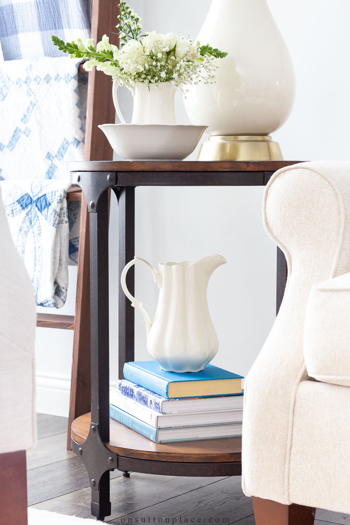
- Nothing is really off-limits, or out of reach, if you are a good thrift store, flea market, Craigslist, eBay, discount, or craft store shopper. It’s totally possible to make a big impact with very little money.
- My favorite ironstone tureen was a Goodwill find, and cost a whopping $3. I rarely shop at the higher-end stores because I know I can find the look for less if I take my time and really try. It takes patience, because sometimes you can’t find exactly what you want. Hang in there though, and keep looking.
- It’s only a matter of time before you find exactly what you are looking for!

3. Make Your Own Artwork
Creating your own artwork is an easy and affordable way to decorate your walls. Frames and mats are available at craft or discount stores, allowing you to personalize everything to match your color scheme. Plus, you can design a stunning focal point without spending a dime on art! Here are a few ways to find budget-friendly artwork:
- Find free printables online. Pinterest houses a treasure trove of free art.
- Search Etsy for original art. Many artists have the capability to scan their original pieces, and sell them digitally.
- Take your own photos. Enlarge them at a photo center, and then put them in frames yourself.
- Take a look at the OSP Printables Category. There are dozens and dozens for free printable to choose from!

4. Add Inexpensive Natural Elements
- Fresh flowers and greenery bring a room to life, and you can use them in your decor without breaking the bank. Add a pop of color by bringing flowers in from your yard, or pick them up at the grocery store.
- It’s amazing how a $10 bunch of flowers can make you happy, and light up a room!
- Forage for pinecones, add dried lavender, cut low branches from your trees, or display your produce. The next time you are feeling stuck with your decor, and don’t have much money, give this idea a try. You will love it!

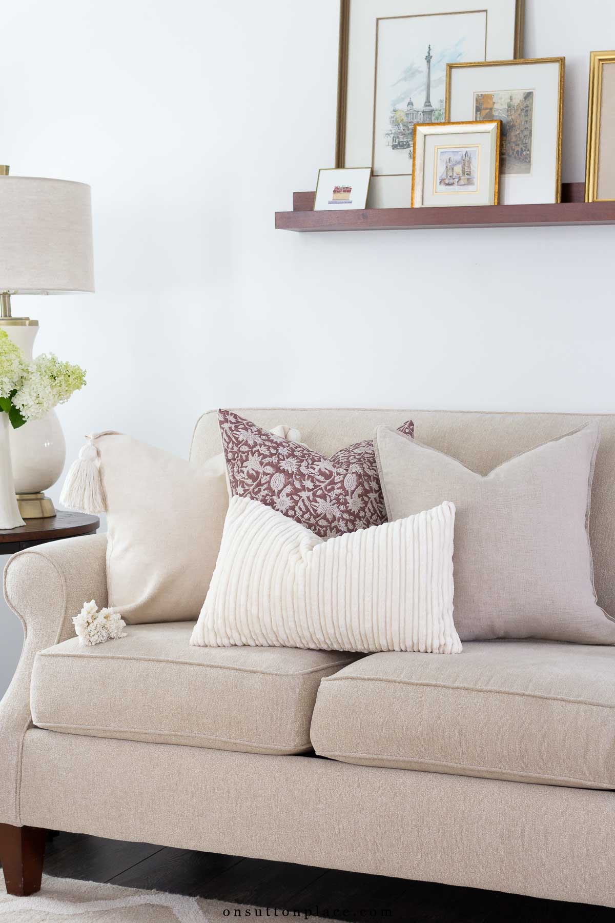
5. Use Throw Pillows + Blankets for Color, Style, & Texture
No list of budget decorating tips would be complete without highlighting the versatility of pillow covers and throw blankets. These simple items offer an easy, affordable way to refresh a room’s look—whether you’re updating seasonally or just for fun. By selecting two or three main colors, you can mix and match various patterns and textures seamlessly. For example, I use a palette of blue and neutrals, incorporating different shades of blue and adding texture with the neutrals. This allows my pillow covers to be easily swapped between rooms, creating a cohesive yet flexible design.

6. Stay Away from Trends and Buy What You Love
Nothing will drain your budget faster than chasing every new style trend. Resist the urge! I’ll admit, I’m sometimes tempted by that trendy rug from Crate and Barrel or the fun vase at West Elm, but I always talk myself out of it. I know I’d quickly tire of those items because they don’t truly reflect my personal style. Instead, focus on buying pieces that make you happy every time you walk into a room…not just what’s featured in the latest catalog. Unless, of course, what’s on the cover genuinely brings you joy!

7. Connect the Dots with Paint
A fresh coat of paint is affordable, and it’s one of the easiest ways to make a big impact. It’s the quickest way to completely transform a room, instantly changing its mood and style. To create a cohesive look throughout your home, it’s best to stick to a consistent color palette. By keeping everything in the same basic color family, you allow each room to flow naturally into the next, making your space feel larger and more harmonious. For added depth, you can play with different shades of the same color, or introduce an accent wall for a subtle pop of contrast. See our paint colors HERE.

8. Shop Your Home & Stash
Remember to shop your home before buying anything, and to look through your “stash” regularly. Most of us have a place where we keep decor items that we may not be using at the moment, but aren’t ready to discard or donate. You might be surprised at how easily forgotten items can be repurposed or refreshed with a little creativity. Rearranging these pieces, or pairing them with new accessories, can breathe new life into your space without spending a dime.

9. Update Your Hardware
One of my favorite budget decorating tips that has a huge visual impact is changing the hardware on cabinetry or furniture. It can instantly update an old piece, and it’s the perfect way to add color where there is none. It’s also an update that can be accomplished over time, which is a very budget-friendly way to decorate. Take it slow, and update at your own pace.

10. Know When To Splurge & When To Save
Personally, I think this is a hard one…especially if your first instinct is to always go the less expensive route. (I’m raising my hand!) It’s definitely OK to splurge on your home decor, but do it intentionally. Sometimes spending less is perfectly fine, and the end result isn’t compromised. Other times, it’s best to buy quality furnishings, that might be more expensive, but that last over time. For example, a sofa your whole family uses, the wallpaper that adds so much personality, light fixtures, kitchen cabinets, area rugs, or curtains.

FAQ’s

Shop + Source
*As an Amazon Associate, I earn from qualifying purchases.
tufted chairs | striped pillow covers | living room rug | 3-tiered table | blanket ladder with baskets | faux eucalyptus | light blue throw blanket | navy blue throw blanket | block print pillow on sofa | end tables | table lamp (similar) | coffee table | sofa is no longer available | vintage Liberty Blue pitcher | small blue marble lamp | set of candleholders in entry | block print pillows in entry | navy blue entry rug | armchair in entry (similar) | crystal door knob
Share your budget decorating tips!
Thank you for sticking with me until the end! As I mentioned at the start, I hope you’ve discovered a few new budget decorating tips that inspire you. The most important thing to remember when decorating is to fill your home with meaningful pieces that bring joy to you and your family. It doesn’t matter how much they cost or where they came from—what truly matters is that you love them. If you have a favorite tip or idea to share, I’d love to hear it in the comments!


PAINT COLOR GUIDE
Choosing paint colors is not always simple!
Use this guide to help make your
own paint color decisions easier.


Thank you for sharing.
Excellent article!
Great tips Ann. I’ve often just switched items, small and large from one room to another, and I’ve gotten a whole new look. Or just put items away for a bit. And that’s no cost. My kind of decorating the older I get. Enjoy your day! ;)
If you spurged on that white and blue vase w8th the church you were spot on! I always enjoy your posts. God bless.
I love these suggestions! I have an internal budget spidy that keeps me from blowing the bank on decor! I’m guilty of wanting cheaper furniture/big items and my husband generally talks me out of it. He goes for quality and durability. This means that they sometimes fall out of favor with the design world, but when we bought them we conscientiously though they were “classic”. I sometimes have to decorate around my expensive cherrywood pieces and my big brown couches (those will be replaced though in the next few months), but I’ve managed to keep things light and airy by purchasing lighter textiles, pottery and other decor. I love switching things out with the seasons, but I find myself decorating with a lighter hand these days. I also think keeping my home clean and clutter free is the biggest decor boost. I love your blue color scheme…it’s timeless!
I went to a party once, with a bunch of my fellow teachers, where we each brought 1 or 2 decor items that were in good shape but were willing to give up, sale or trade. There were about 15 of us there, and we had such a great time. I took a little cowboy lamp from my youngest sons boyhood room (he was getting married that summer and didn’t think he’d need it🥲) and two mismatched tea cups and saucers. We had so much fun, and I thought a couple of gals were going to come to blows over that lamp. Well, we are in Texas. You’ve got me thinking, I need to have a decor party of my own!
Ann, you are such an inspiration! Thanks for sharing your wonderful tips with us. Your home is absolutely beautiful. You always do such a lovely job with all your decor.
Thanks for this. I am not a natural decorator and I really need a pick me up. I appreciate the ideas. My home is in transition with my last child, sadly, leaving the home and I am frustrated by my lack of options for moving furniture around. Your advice helps.
Totally agree! I wanted to do something different to my fireplace (it’s not your normal fireplace) After contemplating many ideas, as well as expense and seemed like it took forever, it turned out that paint was the secret! Can’t get much easier then that! Thanks for your great ideas.
Love your fresh and pretty blog, Ann! One budget tip I have is to completely clean (top to bottom, spring clean!) and de-clutter a room before you spend a penny on it. Maybe move some things around (re-arrange furniture, if it suits). Maybe bring in something from another room. Then I always add fresh flowers or greenery from the yard. If the room still needs it, make an inexpensive purchase for the room as a reward (a new pillow cover, for example). Oftentimes the room feels fresh enough that you don’t even need to spend money on it. I find this method is also good incentive for getting rooms cleaned and organized. Thanks for all the lovely inspiration!
I agree with your buget tip. I do the same trick. First your place gets clean 😉 then if you decorating for a season then you bring out your decor that you havent seen for awhile. I go through my “stash” and if there is anything that I dont want anymore I either donate it or see if a friend would be interested in it.
Lorri
Hi Ann! I agree with just about everyone else – you have amazing ideas and helpful hints! One thing I do to freshen my rooms is to simply rearrange the furniture. We have a smallish home but I still have a couple options for furniture placement. It always feels like I’ve done so much more than moving the furniture around!
I break down my decorating goals and projects each season – August’s project is to paint our front door Naval Blue! I have had a French blue for a few years, and I am looking forward to the change.
You have the freshest, prettiest rooms and pictures. Thanks for all the inspiration! Cheers!
Great tips, Ann! I recently repainted my kitchen table top, bought a new pitcher at Home Goods to put on the table, and regularly fill it with fresh flowers from Trader Joe’s. I feel like my kitchen has new life!
Wonderful ideas. I have used many of your ideas over the years after I discovered your blog. Thank you for a delightful post.
Thank you for these practical and great tips. I especially love being reminded to go with what you love, not the latest trend. It can be easy to fall into that trap and be stuck with something that just isn’t you and your family. After all, who is going to be living with it and looking at it everyday? Our home should reflect our lives and make us happy and comfortable. We do not live in an Instagram Picture😉
I would add to this list under the diy art that if you see craft art ( online, Pinterest etc) that looks like it might be possible for you to make – go for it! I have a turquoise and white theme at our cabin so thought I might try some coloured glass and shell art I saw. I gathered old frames with glass, painted them white then added glass I broke (old gin bottles) with dollar store glass filler, flat marbles and glass bits to them with white glue. I then added shells from Walmart and my travels and sea stars from Michael’s. Voila! I achieved results which were worth close to 100$ And more on Etsy for around 10$! I have given away many as gifts and even sold some!
This sounds so cool!
Ann,
Seems as though I’m not the only one who read it all the way to the end. Well written and full of good ideas.
All good tips. I have a couple of suggestions. First of all, I look at all the higher end vendors, Serena & Lily, etc., then I figure out a way to duplicate some of their ideas. Second, as far as art work goes, although I have a few commercially made pieces of art on my walls, I choose photos my husband has taken on our trips – Italy, Ireland, etc. I then go on line and have them printed on canvas – I have three of them in our home now. and have a fourth photo selected to do. You can pick your size and other details – never have had a problem. I also have printed off some of the photos here at home, and my nephew and his Mom go to garage sales and they look for nice frames for me. I purchase the mats, paint the frames white, and they are so nice. I love these prints because first of all my husband took the photos, and they are unique and no one else has anything like them. It’s easy to pick out the right photos to fit your color scheme and decor.
I love to decorate with photos…and creating the look for less is always a good idea!
I LOVE this post, Ann! We’ve just downsized (tough stuff right there), and are having a ball with our new home. Interestingly, just last week we changed out all the door hardware and freshened up the doors and doorframes. One of my go-to decorating tips is to use books. We are both read-a-holics, so we have plenty to use. And I’ve established the “stash” you talked about. Great resource, and you can’t beat free.
Great tips.With downsizing,lots of things had to go.I always shop my house repurposing items with paint and spray paint.It gives the them new life in a new space.